Visualize your WHOOP metrics like never before
Visualizing your metrics is where fitIQ started and it remains at the heart of everything we do.
Analyze your entire WHOOP history
fitIQ was built to help you spot long-term trends measured over months and years, not just days and weeks. That’s why you can slice and dice your data however you want: view graphs over a range of a day or two right up to years or even your all-time statistics. Whichever range you choose, fitIQ updates instantly, with no loading screens or waiting around.
Striking and insightful visualizations
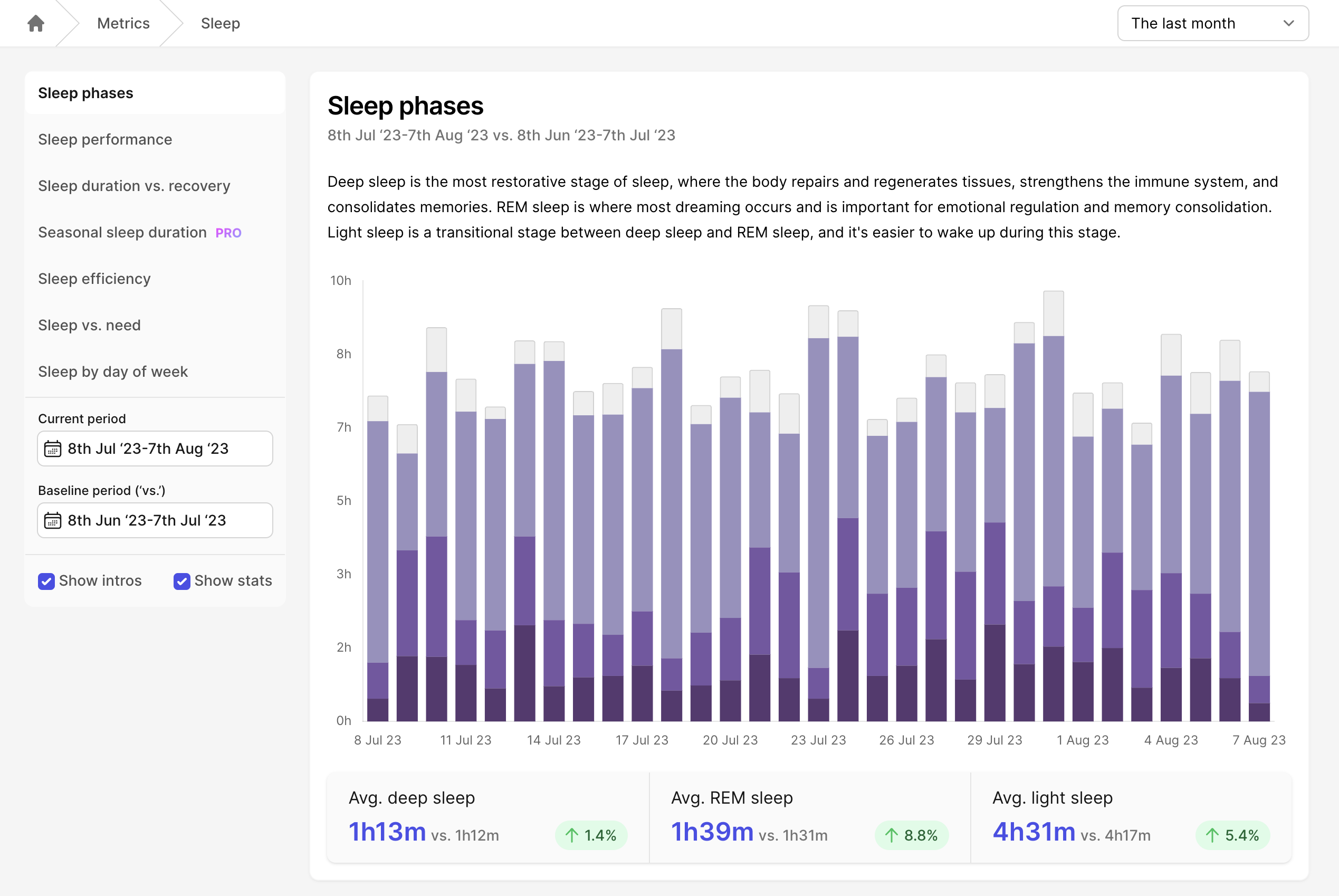
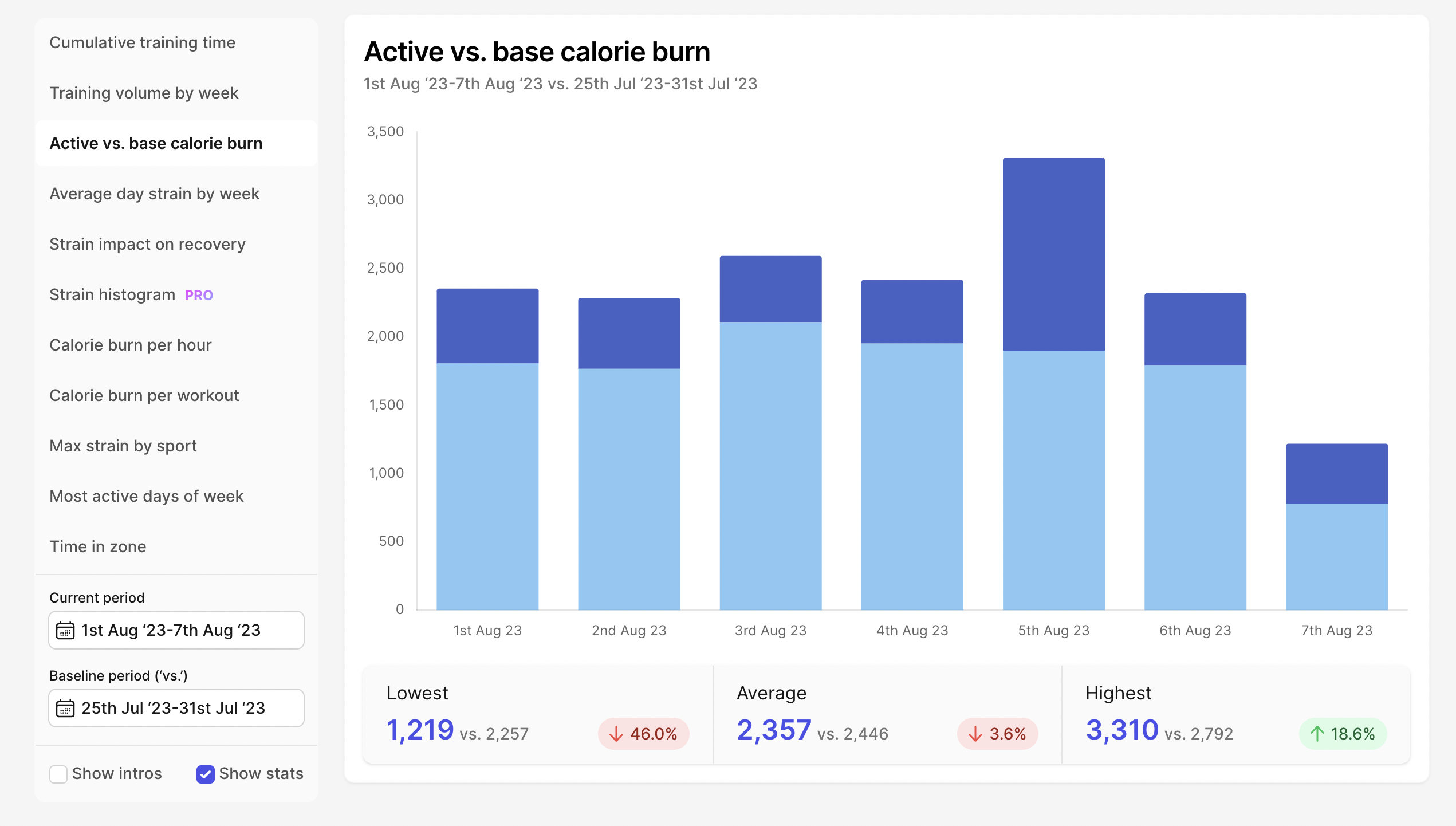
Some graphs are simple, tracking a single WHOOP metric at a time. Others are more complex, combining multiple metrics for added insight, such as our active/base calorie burn split graph or our Strain vs. Recovery graph shown below:
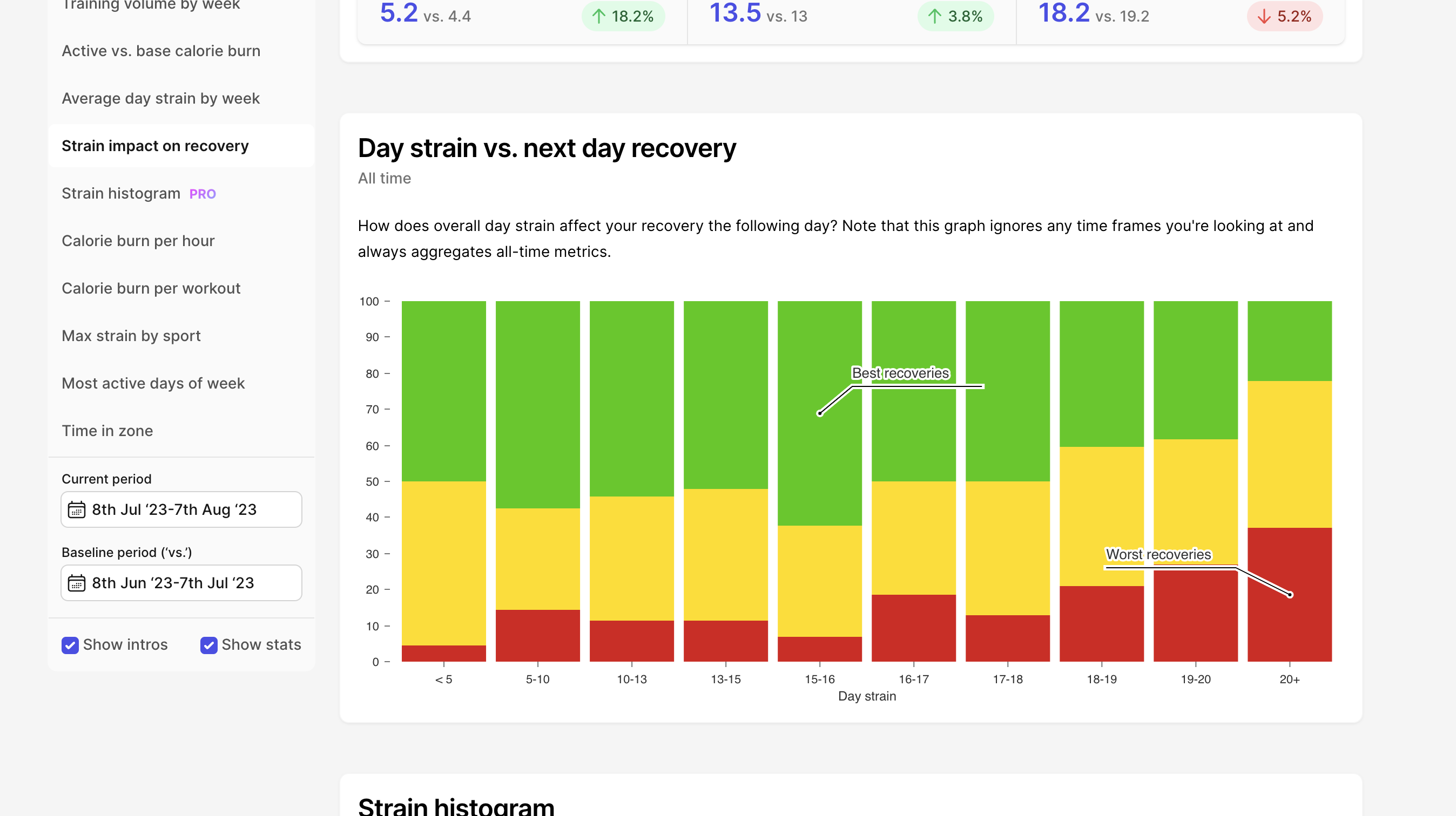
See how your strain on one day typically impacts your recovery on the next
Metrics categories
Metrics visualizations are currently divided up into the following categories:
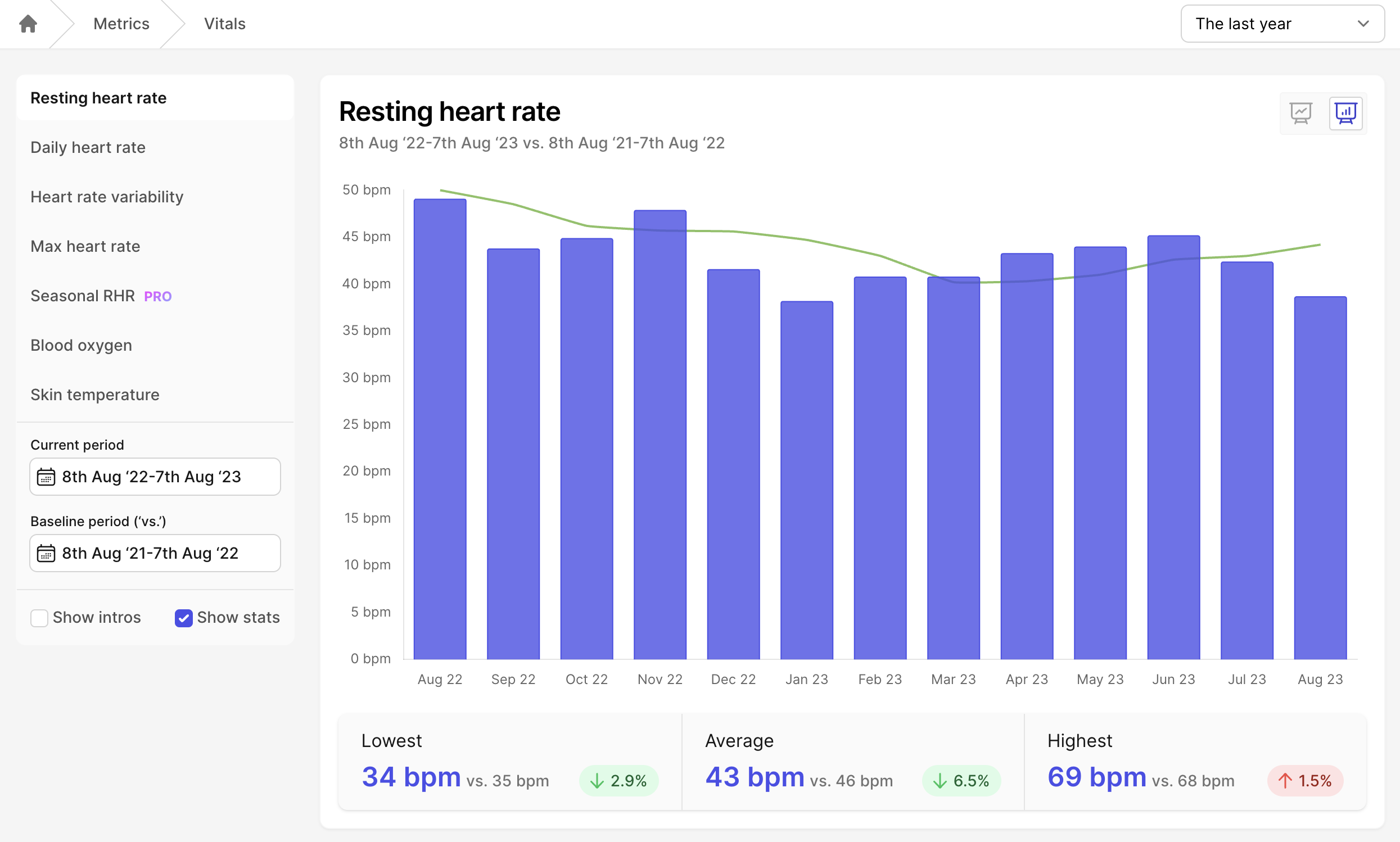
- Vitals: a range of charts covering heart rate, heart rate variability, respiratory rate and more
- Training: graphs showing how your training is progressing and paying off over time
- Sleep: see how your sleep habits affect other key metrics
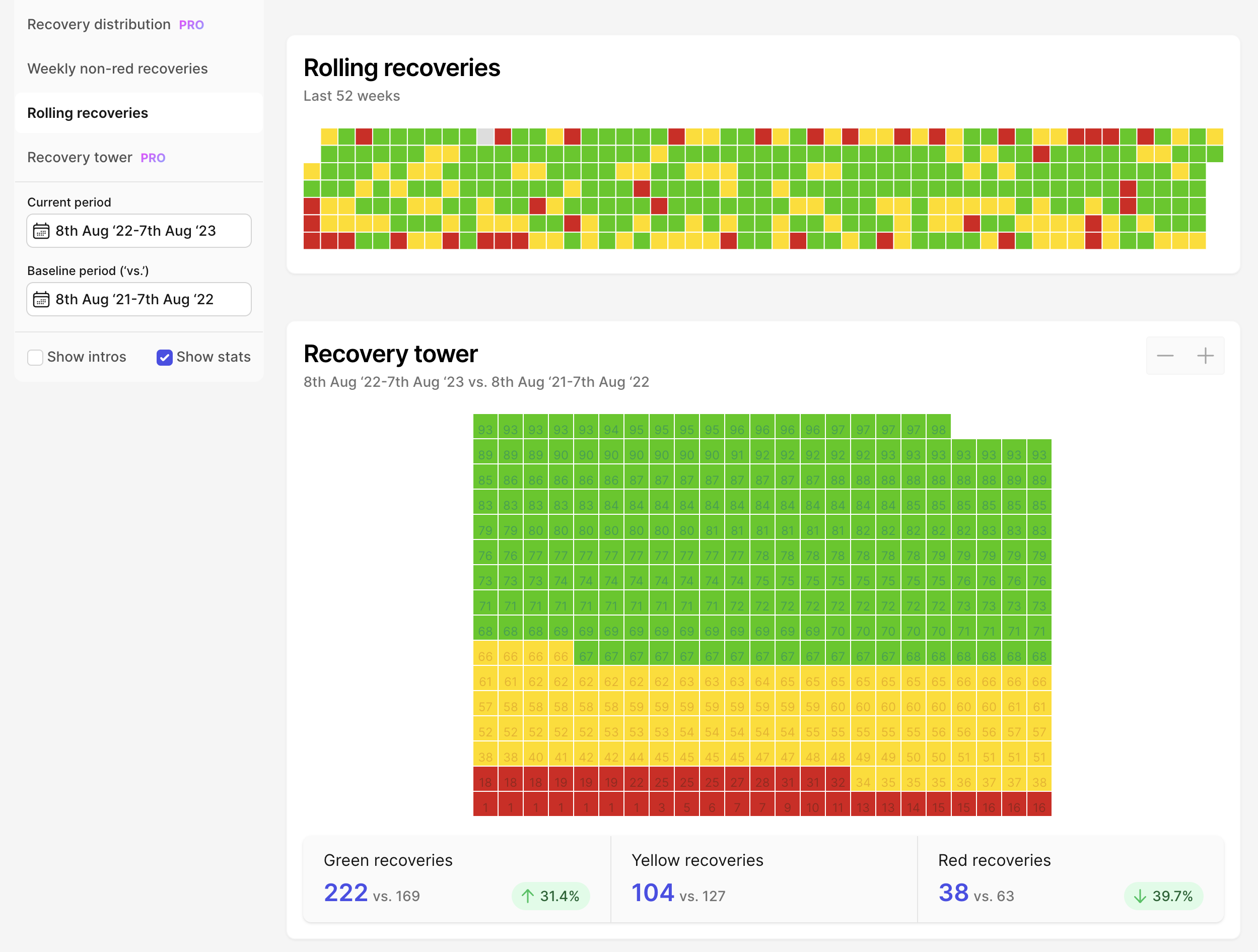
- Wellbeing: get insight into your WHOOP recovery like never before
Slice the same data in different ways
Some graphs are too good to only enjoy once. That’s why plenty of them have controls which allow you to view the same underlying data in multiple ways.
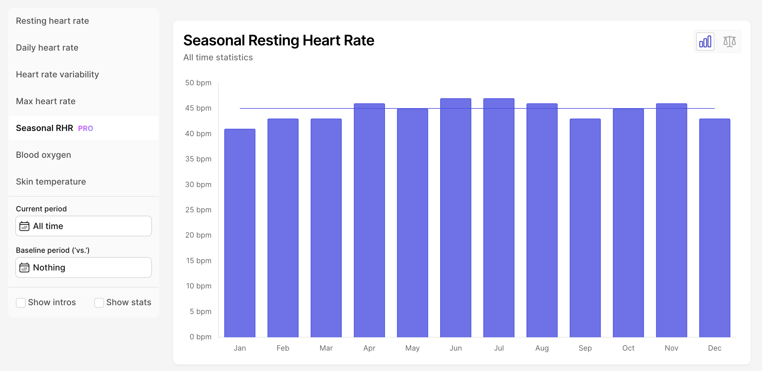
Seasonal RHR as a standard bar chart
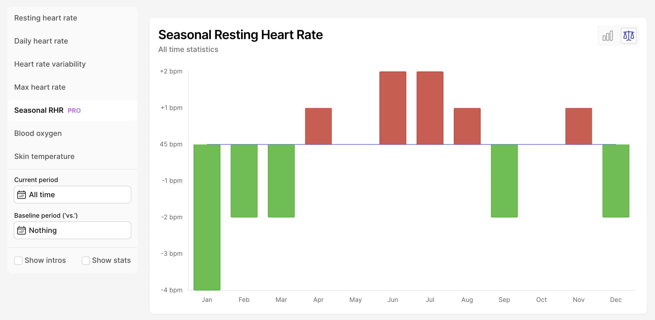
Seasonal RHR as a delta +/- chart
Sign up to see your metrics
Sign up and start for free and if you like what you see, go Pro whenever you want.